The Ark was meant to be a magazine — digital and physical — covering local culture and the music scene. Me and James Sheriff cooked it up back in the Consumer days, and the frontman of Reverend and the Makers reckoned it was a good idea. (It was not a good idea.)
We went all in. Built the website, started designing the actual magazines, and spent ages branding the whole thing — each one printed in monochrome, but on coloured paper. The site would pool all the content for a given area into its own little online magazine.
The annoying part: we were years early. Local websites, local magazines, hyperlocal everything — nobody was doing it yet, and we already were. The idea was ace. It just never got the head of steam it deserved.
If it had gone further… maybe I’d never have started an agency.
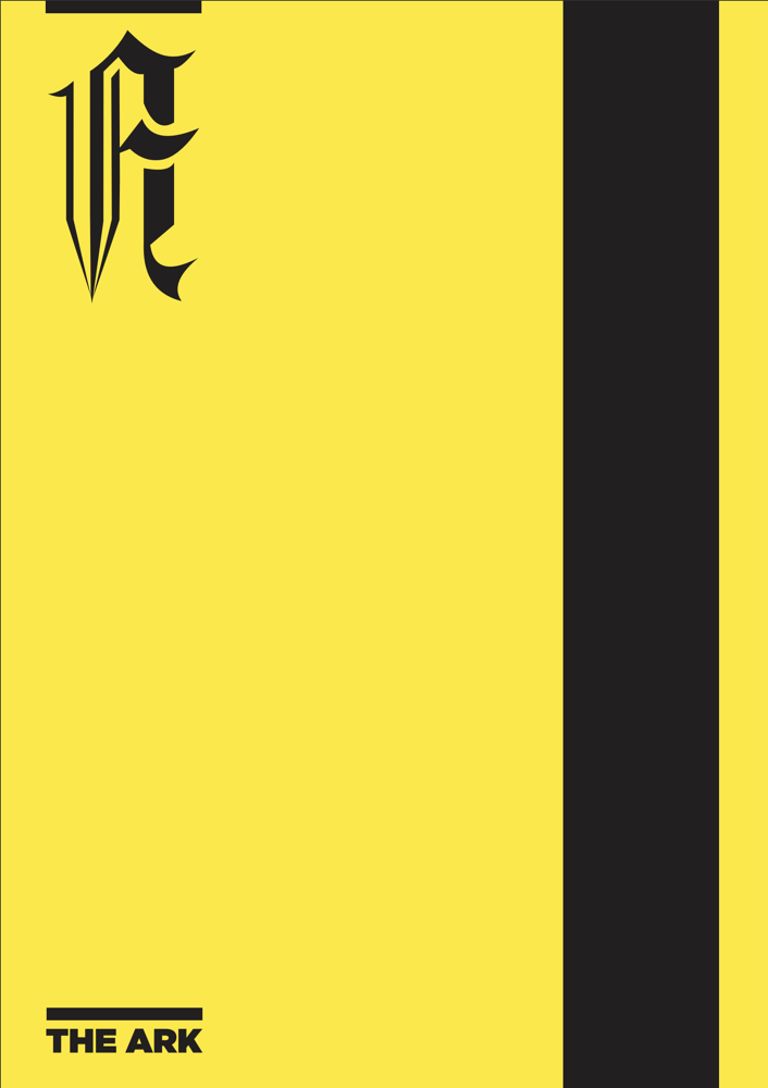
For years I thought I’d lost all of this. Then a couple of bits turned up. An example front cover, the blackletter A printed monochrome on coloured paper, exactly like I described:
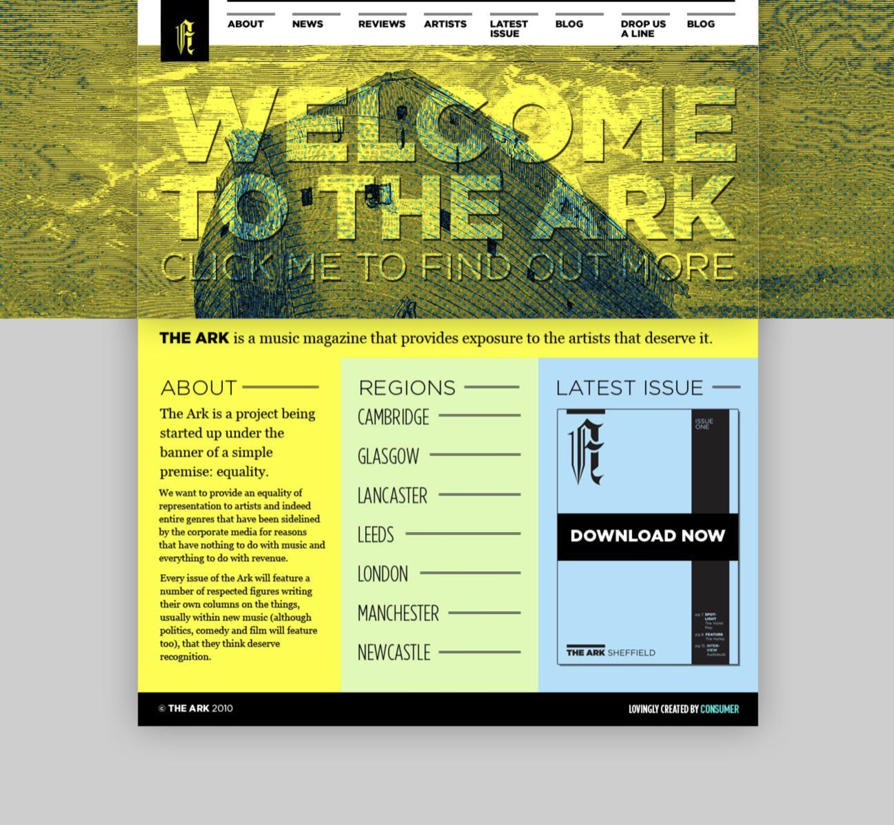
And an example of the website design:
There’s a bit more in my old tweets too. Designing it, January 2010:
Experimenting with colours and layouts for @thearkmagazine.
27 January 2010
And a few months on, sounding more hopeful than it deserved:
The Ark. Final stage of a massive very large, twisting and turning project.
28 May 2010